TWSBI 580 AL-Turquoise
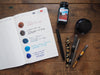
The TWSBI 580 AL-Turquoise is in! This is one of my favourite releases from the TWSBI AL in their special edition colours. So far there's been an orange, purple, blue, pink, green, but this one took me by surprise, since I'm normally not a turquoise person. Like all of their special edition AL-colours, they're only going to be around for a limited time. The coloured part of the pen is the metallic section, so all of the past colours are naturally a bit more of a metallic shade of hue, and this turquoise version is almost a minty turquoise. The 580 AL is the same pen as the 580, except with a few aluminum parts rather than plastic. It makes for a very slight weight difference, as well as the idea of some parts of it being metal versus plastic which I think as a philosophy I generally prefer, but it's mostly an aesthetic difference with the special edition colours. A while ago I wrote a blog post outlining a few differences between the 580, the 580-AL and the ECO, if this brand is new to you.


 One of the things about TWSBI pens is that they're clear - I love demonstrators, especially TWSBI ones that have the slight bit of colour added through the grip section and piston in the AL-colours, but that first fill is a lot of pressure to get it right, especially when you're going to blog about it, and immortalize it forever into the abyss of the internet. I inked mine up with a trusty, favourite brown, Diamine Ochre. I was waffling between a matching ink colour (Diamine Blue Steel? J. Herbin Bleu Pervenche? Even a dusty grey purple to match the mint, like Sailor Chu-Shu??) but Jon convinced me that by saying it would look like mint chocolate chip ice cream, one of my all-time favourite flavours. Even though I love this ink, I'm not sure if it was exactly the perfect choice. I'm not one to fill a TWSBI with an ink I'm not fairly sure I'll love, since the tank on a TWSBI lasts a long time - I suppose especially when you have too many pens filled with ink at once - but this combination is less mint-chocolate-chip-ice-cream than very-dark-chocolate-ice-cream-with-slight-hint-of-mint. The writing sample is with a fine nib, in a Hobonichi.

 In any case, I'm enjoying the pen. If you couldn't tell, I'm big on seasons of life, and having my pens and inks and tools and supplies flow together - and this mint is perfect for spring (although it will also be a great winter pen). I'm normally a broad nib person, but I'm discovering that too many broads, even for someone who works in a stationery shop and is surrounded by excellent paper, is a bit limiting. In fact, there have been times when I've literally needed to borrow a pen to use because all of my inked nibs were too crazy, a fact in itself which is a little crazy.
 In other news, we've got a line of ink launching later this week. It's always exciting to get new ink in, but this line in particular is one I can't wait to share.
Related Posts
Currently Inked in February
It’s February, and here I am with a few new inks in my pens. J. H...

My 2021 Analogue System
I try to do this post every year, a look at what notebooks and plan...

Currently Inked During Winter Lockdown
New inks into freshly washed pens! Noodler’s Black Swan in Au...


Comments
Anonymous said:
That is a great choice of ink! I might have to try it in mine :)
I know what you mean about the size: I have both 580s and Minis, and I generally prefer the Mini. However, like you, I love the turquoise colour! Unfortunately there is no way to swap between the 580 and Mini pieces, they are different sizes. However, TWSBI does release special editions in their Mini as well (blue, gold, etc.) so perhaps a turquoise is in the works.
If you are interested in the 580 Turquoise, I would recommend picking one up from a retailer soon. We are all sold out in our shop, but if you find another shop that has it in stock, it probably won’t be in stock for long! :)
Anonymous said:
The Kaweco Paradise Blue and Turquoise are the same! Sorry about the confusion :)
I’m not usually a matching pen + ink person, but something about these TWSBI sort of calls for it. Your orange match is another good one, I may have to ink up my orange one as well!
I will let Sarah know you say hello :)
Debi said:
I think a good match for this TWSBI would be Diamine Eau de Nil. It’s a medium-dark aqua color with tons of shading. That would be my choice!
I’m normally not a fan of TWSBI 580 AL fountain pens because they’re SO big and you can’t post them. I generally post all of my pens; it just doesn’t feel right not to. And I have very small hands, so the TWSBI minis are just right for me. However, I’m on the fence on this one. I absolutely LOVE the soft aqua color; it’s my favorite! I wish I could get this color in a mini. Hmmm…I wonder if I could switch out the color pieces to a mini TWSBI? That would be quite a hack job, for sure. I might have to explore that option!
I wonder if anyone out there has ever tried that…?
Sherrill said:
Liz,
I have totally fallen in love with this pen. I have not always matched my ink to my pen but with Sarah’s help I narrowed down some perfect ink colours and although Diamine Blue Steel was a close second, I chose Kaweco Paradise Blue and I LOVE it!!! This is quickly becoming the pen I grab first out of my pen case! :)
Anonymous said:
I’m so glad to hear it! Although I am also not really a pen and ink matching person, I feel like in this case I really should’ve been! I did not even think of Kaweco inks, although I have the Kaweco Pearl Black in a pen now and am really enjoying it. Perhaps I will try it next! And of course Sarah is always excellent at helping with ink selections – I sometimes feel like I need her objective voice to help me rather than my own wishy-washy-ness!
Sherrill said:
I hear you on all those points, Liz! This particular pen/ink match feels so right. (Similarly, earlier this year I matched my TWSBI Diamond 580AL Orange, with a bold nib, with Diamine Autumn Oak and I love that pen/ink match too!!). Question for you though — is the Kaweco Paradise Blue the same as Kaweco Turquoise? I only bought a sample of the Paradise Blue from Wonder Pens but I cannot seem to see that colour available for sale on your website…only Turquoise. Let me know and have a great day! Tell Sarah, Sherrill says hi!! :)
Anonymous said:
It’s perfect timing – new ink for your new pens ;)
Anonymous said:
It’s a beauty! And what a great pairing :)
Helene Peloquin said:
Just received a big order from you last week, I guess I’ll have to place another one soon. I really want this pen and try your new inks, the Kyo No Oto. So glad you are bringing new inks.
Anonymous said:
You are too kind! I have come a long way since my earliest days of blogging, however, the bar was pretty low then so I’m not sure how much that says, haha!
I’m afraid it’s not Robert Oster – it’s a new line from Japan :)
Anonymous said:
I’m a big fan of the newest AL as well (if you couldn’t tell!), and I’m glad to have it in my collection this season. We have heard great things about Robert Oster inks – a line for us to look into! :)
Karen said:
I can’t wait for mine to arrive with a medium nib and I have a bottle of Iroshizuku Tsuki-yo ink waiting! ?
tim parris said:
Ink launching… and I just bought two new pens! Bummer!
Anzan Hoshin said:
Liz, your photography is excellent.
Regarding the ink, since you can’t wait to share, might it be Robert Oster?
Helen said:
I really like the colour of the new AL and I’ll bet it would go beautifully with Robert Oster inks. Just a thought.